Basics #08 It's really about "easy-to-use" tones (color tone)
Knowing tones allows you to do the following, which is useful for people who actually use "colors."
- Color measurement data results can be viewed in a list, making it easy to use as marketing data.
- It becomes possible to use it in terms of images, making it easier to convey the message, and at the same time making it easier to remember the atmosphere.
- Easy to create color schemes.
Let's take a closer look.
Recently, when talking about colors, there have been more opportunities to express them numerically, such as in RGB or Munsell numbers. It can be said that it is now used as a common language in a wide range of fields and that understanding has progressed. There is also a color sample, so it seems that people are getting used to it.
When I talk to people in various fields, it seems that they have a good understanding of "hue." However, when it comes to "brightness" and "saturation", I feel that it becomes a little vague.
``Lightness'' corresponds to gray scale in common for all hues, so by pointing out the color of an object or material that serves as an indicator and telling people that the brightness of that color is ○○, they will be able to ``remember'' it to some extent. Probably. For example, you may sometimes see a finish called exposed concrete, but this is about N7, so it might be helpful.
However, there is a pitfall here as well: when using a dark color with low brightness, such as a lightness of 3, a chromatic color with a tint will appear brighter than an achromatic color even at the same brightness. The discrepancy between numerical representation and how colors appear can be troublesome if you are not used to it.
What is even more difficult to understand is "saturation." For example, research has shown that the color in memory or the color when answering from memory (memory color) emphasizes the actual color and is remembered as a color with higher saturation than the actual color. Of course, the same tendency exists with respect to brightness, but as I mentioned earlier, it may be possible to express it using examples and things that can be used as indicators, but "saturation" can be said to be quite difficult to express. The distribution of saturation differs depending on the hue, so even if the saturation value is the same, it will feel more vivid or more subdued depending on the hue.
If you memorize the tones, it will be easier to learn the overall image of colors.
As mentioned earlier, it is not easy to memorize detailed brightness and saturation values, and the concept of "tone" was devised to compensate for the inconvenience when using colors effectively. .
In fact, in Japan, research on "tone" is progressing, and there are several ways of thinking about tone, such as the PCCS color scheme developed by the Japan Color Research Institute, and the tone system developed by the Japan Color Design Institute. is used. In this way, it can be said that Japan is a country where research into "tone" is active, but it seems that many people are not familiar with "tone" either. People outside of the color field often ask me why we need to think about "tone" and that it's vague and not good.
The idea of ``tone'' is very useful once you learn it, it makes design development easier, and it makes communication easier, so it is an idea that I would like to see spread in more fields.
What is tone?
Tone is a concept that regards colors as a balance between lightness and saturation, and is a classification that groups together areas that have a "common impression," such as a group that has a "pale" impression.
The advantage of using this approach of tones is that color measurement results can be displayed in a list and comparisons can be made easily.
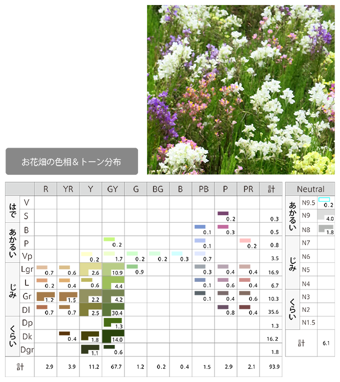
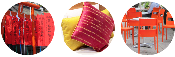
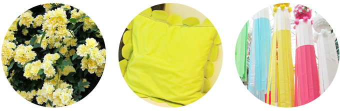
Let's introduce an example of how to extract and utilize hue and tone from a photo.
When thinking about the colors of the botanical patterns that have become a hot topic recently, extracting the colors from photos of flowerbeds will help you determine what hues and tones should be used.
The next benefit is that you will be able to communicate about colors more smoothly. It is used as a color modifier, such as making it a very pale RP pink, and at the same time, it can also convey an image of lightness and softness. Research by the Japan Color Design Research Institute has obtained data that shows that tone has a 3:1 advantage over hue in contributing to image and impression effects.
Furthermore, when making full use of colors such as color schemes, it is easier to propose combinations, as any strong tones have the commonality of being ``colors with high saturation but with a bit of gray'', so it is easy to harmonize them. It will be. In the Munsell system, the lightness and saturation distribution varies greatly depending on the hue, so it is difficult to theorize about color schemes, and there is no mention of color scheme, but using the Hue & Tone system will help other researchers. This allows us to apply the color theory we developed.
As mentioned above, by incorporating the concept of tone, you can achieve the effect of making it easier to apply colors.
- Color measurement data results can be viewed in a list, making it easy to use as marketing data.
Although it is based on the Munsell color system, it can be displayed in two dimensions, making it easier to see at a glance and understand distributions, etc. - It becomes possible to use it in terms of images, making it easier to convey the message, and at the same time making it easier to remember the atmosphere.
It has become possible to use it in terms of images, facilitating communication by conveying it to others and memorizing it. - Easy to create color schemes.
You can apply color theory and easily consider color schemes.
Organizing the tone
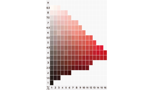
5R equihue surface diagram
- The color in the image above is reproduced based on data scanned from the original, so it may differ from the exact color.
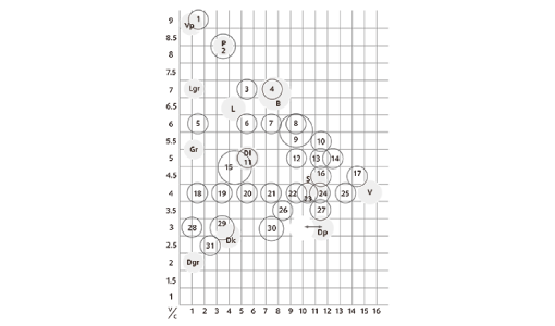
Diagram of tone division on the 5R isohue surface
The basis of tone classification is based on research into how familiar colors have been called in each country since ancient times.
In 1966, the Japan Color Design Institute created a color chart of 5,000 colors based on the Munsell color system, and at the same time began research on color names. The classification of "tone" is based on this research on color names. Based on literature, including those from overseas, we named the place where color names are concentrated the pregnancies point (a position that concisely represents an image), and with that as the center of each tone, we divided the range of tones into 12 of the 40 hues. Setting. This is because we have come to understand that, beyond the difference in hue, if the tone is the same, there is a common image.
This means that it can be expressed using common adjectives such as "dark feeling" and "heavy feeling".
Once you learn the classification of "tone", it will become easier to use words such as "memorize" and "color scheme".
As I investigated further, I realized that "tone" is more important than "hue" in determining taste trends. For marketing purposes, understanding the concept of "tone" will be helpful when reading results and formulating tactics.
Comparison of JIS color charts and tones
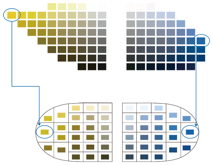
In the Munsell method, the brightness and saturation of the most vivid pure colors differ depending on the hue, but if you refer to many color schemes, you can say that the bright colors are easy to combine. However, it is not clear how to do this just by looking at the Munsell color chart.
If you consider this as the same tone as vivid tone, it will be easier to understand it as a color scheme. The figure below shows the most saturated color, vivid tone, of 5Y and 5PB. These two colors create a pleasant and easy-to-like color scheme. However, in the JIS color chart, the brightness and saturation differ depending on the hue, making it difficult to understand the possible combinations. In comparison, I think the tone diagram below makes it easier to understand the theory of combinations.
So let's take another look at the idea of tone. Here, we will use the Japan Color Design Institute's Design & Tone System as an example.
This diagram shows the positional relationship of tones and 10 hues based on the balance of lightness and saturation.
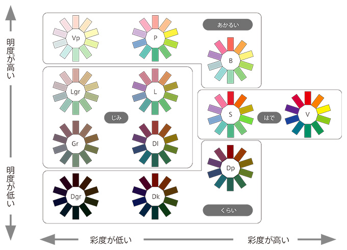
| symbol | Notation | How to read | meaning | |
|---|---|---|---|---|
| Bare | V | Vivid | Vivid | sharp |
| S | Strong | strong | strong | |
| Bright | B | Bright | bright | bright |
| P | Pale | pale | pale | |
| Vp | Very pale | Berry Pale | Very pale | |
| Jimi | Lgr | Light greyish | light grayish | light gray |
| L | Light | light | Yowaii | |
| Gr | Greyish | grayish | Ashen | |
| Dl | Dull | Dal | dull | |
| About | Dp | Deep | deep | deep |
| Dk | Dark | dark | dark | |
| Dgr | Dark greyish | dark grayish | dark gray |
Japan Color Design Institute Co., Ltd.
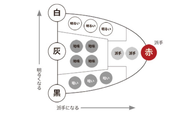
Master the tones - Start by learning "Akarui-Kura" and "Hade-Jimi"
I think it's quite difficult to memorize 12 tones instantly. It would be a good idea to start with four distinct groups.
The bold tone gives the impression of a sporty and lively feel. Jimina tone has a gentle, calm and quiet atmosphere. You can also feel the feel of the material. Bright tones are suitable for conveying a soft, delicate impression. As you can see, the dark tone is easy to express the feeling of time passing and the feeling of gravity.
Bare
Bright
Jimi
About
October 12, 2017
Text by Japan Color Design Institute
Share