Basics #07 “How to see colors”
Colors have the property of changing their appearance in various ways depending on conditions and conditions. As mentioned in the theme of measuring color, we are often confused by the difference between numerical values and how colors are perceived. It would be a good idea to remember the rules that change the way you see things and use them in your daily life.
natural landscape colors
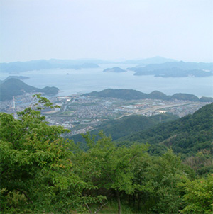
Sunlight hits small particles in the air and scatters before entering your eyes. At this time, blue light with shorter wavelengths is scattered more strongly, making the sky appear blue. A similar effect may be why distant green islands appear blue. When you see the hues of nearby plants changing in gradation from yellow-green to green, blue-green, and blue as they get farther away, you can't help but feel ``beautiful'', ``a wonderful expanse of scenery'', and ``an idyllic lyrical feeling''. You may have experienced feeling like this. Based on the accumulation of opportunities to see such scenery, it can be said that ``gradation'' changes are easy to like as a color scheme that calms the mind.
Effect of adjacent colors Contrast effect
Colors appear different depending on the neighboring colors and the surrounding colors.
The center color of the flower illustrations below are all the same color.
color relative ratio

In the two pairs above, you can see a change in the color of the petals, such as reddish petals appearing yellowish, and yellowish petals appearing reddish. This is called relative color ratio.
Brightness contrast

The three pairs above show the difference between when the surrounding area is bright and when it is grayish. If you are surrounded by bright colors, it will look dull, and if it is a grayish color, the saturation will increase and it will look a little more vivid. This is called saturation contrast.
When deciding whether a color of clothing suits you or not, it is often the change in the appearance of your skin that is influenced by this contrast. It will be easier to see if you apply various colors, such as flashy or bright colors, directly near your face. Even if you don't completely change the color of your jacket, you can get the effect by just considering the color of your muffler, scarf, collar, etc. Why not try it?
These are called contrast effects.
You can get the same effect even if you use more elements. Observe the green color below. The image on the left is green on a blue background. Doesn't it feel a little yellow-green? The image on the right is green on a yellow background. The green will look bluish.
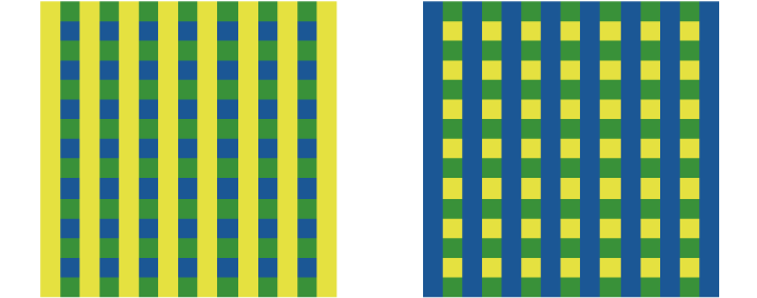
assimilation phenomenon
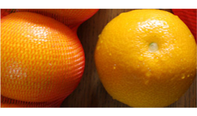
Have you ever seen oranges in a red net? There may be some people who have no experience with it, as it has decreased recently. The mandarin oranges in the red net look redder and riper than they actually are, and they also seem sweeter. We hope you enjoy the magic of color while shopping at the store.
These changes are once again attracting attention in the field of dietary education, as they make the colors of food appear fresher and increase appetite.
area effect
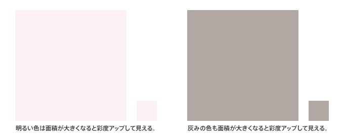
If you change the area, the appearance of the color will also change.
When planning a large area, such as the color of a building or wall, if you select a small color sample, you may be surprised to find that the color saturation is stronger than you expected, or it is too bright.
People who are used to seeing colors will understand this, but generally speaking, when looking at a color with low brightness against a white background, it is difficult to immediately notice it. I have posted a larger version below, so please check it out.
If possible, we recommend checking with a large sample or trial painting, but it seems like this is not something that can be done in practice. I have seen cases where parts of the exterior walls have been repainted during renovations, etc., and the walls are patched together, resulting in an unfortunate situation even though it was intended to be clean. A slight difference in color can easily cause the product to look cheap, so I would like to see careful consideration if possible.

For dark colors, when you increase the value, you will feel both brightness and saturation increases.
Let's look at other ways in which the appearance tends to change depending on the brightness and saturation.
We recommend that you make a color sample as large as possible and check it.
Expanding and contracting colors
Women's magazines often talk about how different colors can make you look fatter or thinner, but it's safe to say that it's true. The bars in the image below have the same thickness, but the lighter color makes them appear thicker. When creating a model for consideration of a product, when I created black and white, the white expanded and looked like it was taking up space. The appearance changes not only on the diagram but also in reality. However, this is also strange, but at the selection stage, some people choose something that looks tight and sharp, while others choose something that looks a little enlarged. This is where differences in people's preferences come into play.
In addition to avoiding the appearance of bloat, you can also take advantage of the appearance of bloat to emphasize a well-defined body.
Here are some well-known examples of simple color changes. One of the interesting things about colors is that they change depending on the background and surroundings. I hope you will make good use of the changes in the appearance of colors to create charm.

May 30, 2017
Text by Japan Color Design Institute
