Applied edition #02 Colors of the city
Colors are used in various ways in life.
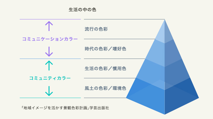
People don't pay much attention to the color of the city, but it has been gradually changing. As our economic situation changed and our priorities for what was important changed, we changed with it.
| 50 years~ | 65 years onwards | 80 years onwards | From 1995 | From 2010 | |
|---|---|---|---|---|---|
| development stage | nascent period | growth period | stable period | maturity period | Ripening period |
| Priority items | Functional priority Material color |
stand out High saturation |
arrange Less saturation |
arrange Material development |
Refinement and quality coordination |
| color | confusion | High saturation multichromaticity |
tone | Color sense | regional color |
| Emphasis |  Convenience/rationality Convenience/rationality |
 Differentiation Differentiation |
 harmony consciousness harmony consciousness |
 theme theme |
 uniqueness uniqueness |
Japan Color Design Institute Co., Ltd.
On the other hand, the color of the city is multifaceted. It is being considered and understood from various positions and perspectives. So, let's take a look at some of the most representative ones.
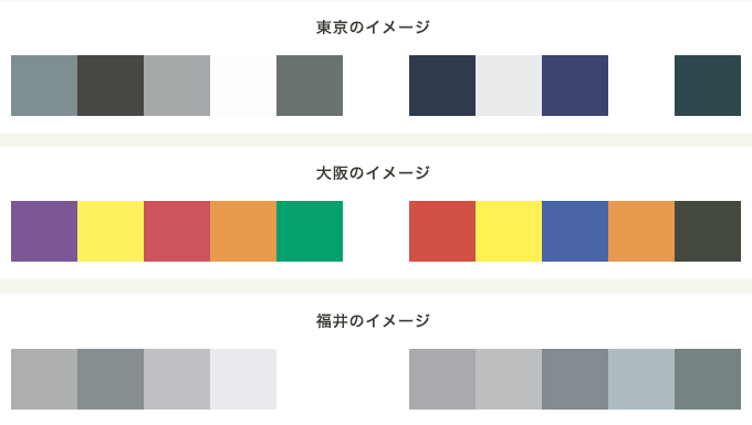
1. Color of regional image/perspective from third party
We conducted a survey to select the most appropriate color scheme for each prefecture from among 40 different color schemes made up of five colors. First up is Tokyo. The top color schemes are black, navy blue, and gray to create a clear contrast and create a neat and cool feeling. Is it a business-like and stiff impression? Next is Osaka. A color scheme with bright multicolors was chosen. It reminds me of the lively pedestrian traffic and conversations around Shinsaibashi. It can be said that they were chosen based on the activity of the people, the atmosphere of the town, and the atmosphere rather than the color of the building itself. For example, what about Fukui Prefecture, which is attracting attention as it prepares for the opening of the Shinkansen? A delicate gray combination. Fukui is rich in famous products such as Echizen crab and soba, specialty products such as glasses, and everything from daffodils at Cape Echizen to dinosaurs, but people from other regions say that it is a land open to the Sea of Japan with beautiful winter scenery. It is likely that Hokuriku, the place that comes to mind, was given priority. Rather than saying that other people don't understand, you should think of it as something that is expected from outsiders, and use this as a great reference when promoting your town.
2. The color of the image that the local community is aiming for
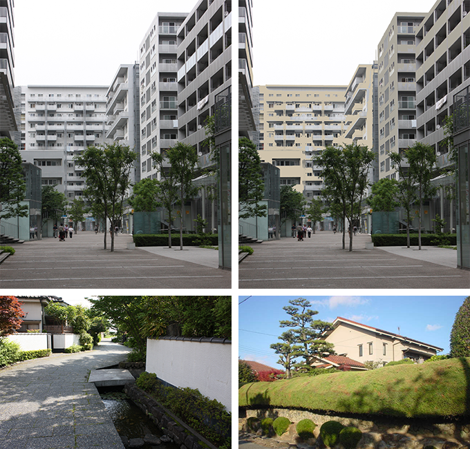
3. Color of buildings and streets
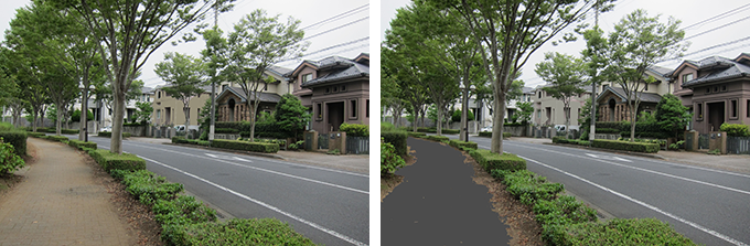
The colors of the buildings and roads that are actually used can definitely change the atmosphere of the town. The high-rise residential complexes are decorated in bright neutral colors and have a modern and dashing feel. As a test, if you change the exterior wall color to a natural beige color, as shown in the photo on the right, you'll notice that it creates a warmer, softer impression. The same is true, of course, in residential areas with rows of detached houses. The atmosphere and atmosphere will change between the Japanese-style silver tiles and white walls and the earth-toned streets. The look of a town can change completely depending on what colors you use. There are different types of garden trees and flowers that suit you. When planning the colors, you want to proceed while considering the image of the finished space.
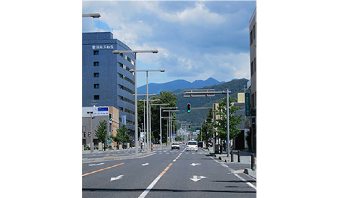
It's not just the color of the buildings, but also the color of the sidewalks. Although we don't usually pay much attention to it, the color of roads and sidewalks actually occupies a large area. Which would you rather walk on, the gray color of asphalt or the earthy color of compacted soil? What colors are used in the town where we live? It's something you don't really notice, but it surprisingly has an impact on your motivation to go for a walk. I think it will be easier to spend each day if you have a path near you that you can walk comfortably and with a positive feeling.
Four. colors around the road
There are various facilities around the road, such as lighting, guardrails, benches, flower pots, electricity, and information boards. These are managed by different organizations and companies, so it's no surprise that they have different colors. However, there is now a growing movement to consider the sense of unity and balance in these colors. There is also the idea of choosing colors that are appropriate for each region. Colors have been carefully considered from various aspects, but because they are so subtle, they tend to be overlooked. Please take a look at your surroundings.
Five. Shop color/ signboards color
The color of ornaments and signboards is also important. Let me introduce some examples of workshops that brought together the colors of Ameya Yokocho near Ueno Station, a distinctive town in Tokyo, and the jewelry town of Okachimachi next door.
I found that the yellow color of the street called Ameya Yokocho, where there are many food stores, exudes brightness and liveliness. In comparison, the corner where there are many restaurants was characterized by the predominance of red and orange colors. When I hear the word "Ameyoko", I somehow get excited. It's no surprise that it's famous for its huge crowds at the end of the year, but I think it's fair to say that the color of signboards and tents like this also play a role.
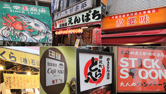
In comparison, there is a corner of neighboring Okachimachi called Jewelry Town. Each of the streets has a name such as Diamond Street or Sapphire Street, and it is a town lined with jewelry-related specialty stores. Of course, there are eye-catching red and yellow signboards here as well, but you'll also see shops with slightly different trends. The store has a color palette that gives off a sense of elegance, luxury, style, and fashion, such as chic black and gray, calm brown, silver and gold letters, and turquoise that evokes the color of gems and precious stones.
You can tell what kind of shops there are and what kind of people gather by looking at the colors of the shops and signboards. On the contrary, people flock to you based on the color of signboards. The color of signboards cannot be overlooked.
One effective activity for increasing the vitality of a town is for everyone to reconsider the appeal of their town from the perspective of color and think about what kind of town they would like to create. I think it would be a good idea to think of it as not just the color of ``the walls of my house'' or `` signboards has always been this color,'' but that it is responsible for the image of the town.
February 29, 2016
Text by Japan Color Design Institute
Photo by Akiko Sugiyama
Share