Advanced edition #01 How to use lamp colors
The appearance of the color of light changes the appearance of the street.
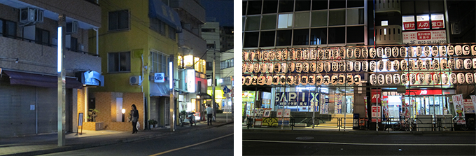
These two photos are of street corners in Tokyo taken on the same day. When I got off at a station along the private railway line, I noticed that the town's expression had changed somehow. When I looked around, the street lights were new, and the simple stick-shaped lights emitted white and bluish light, giving me a lonely feeling. On the right side, preparations for the festival were underway at the next station, and the warm colors of the lanterns were concentrated, giving me a nostalgic, warm feeling of relief and a bit of excitement. The rounded shape of the lantern may also have had an effect. In the photo on the left, you can see a yellowish light leaking through the entrances and windows of shops other than the street lights, creating an atmosphere that makes you want to step inside. It can be said that yellow-red to yellowish light has a strong effect of evoking warm feelings and creating an excited mood.
There is a bus rotary, but the area gets less crowded after 7 o'clock, so I think they might have chosen warmer colors. Blue is a color that has an urban and sharp image. It is a color that is welcomed as fashionable and sophisticated. However, wouldn't it be nice to have a relaxing color at your local station on your way home? When incorporating color into daily life situations, be sure to consider its image and psychological effects.
If you are in the interior design field, there is a way to understand the color of lighting that you are familiar with. This is the Kruzov effect, in which psychological effects differ depending on the color and brightness of light. When the brightness is sufficient, bluish light gives a refreshing and clean impression, but when it is dark, it gives a cold and gloomy impression, and when it is dark, warm light gives a feeling of calmness. However, this diagram shows that when it is bright, you feel hot and uncomfortable.
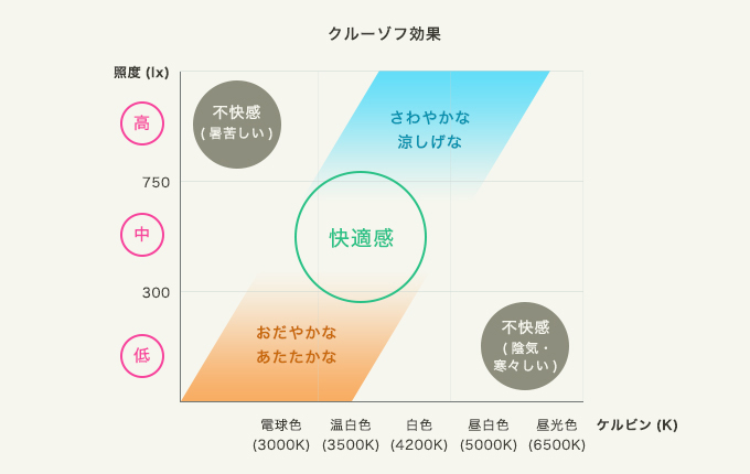
On the vertical axis, brightness is expressed in a unit called illuminance, and the higher the number, the brighter the state. The horizontal axis shows the difference in color, which is expressed in units of Kelvin and is expressed as color temperature. The larger the number, the more bluish the color. When you go home, you want to get off at a station that is surrounded by calm, calming colors, and you may want to take a detour to a store that is bathed in warm light. The color of the lamps plays a role in the liveliness of shopping streets and shops.
In recent years, the light source of lighting has been rapidly changed to LED lamps, and the price of lamps has come down.As LED lighting has become more widespread in general, the terms dimming and dimming have become commonplace. Amid this trend, we are beginning to see more and more research showing that the color of light affects work and sleep. Humans are equipped with an internal body clock, which follows the rotation of the earth on an almost daily basis, creating a rhythm of being active during the day and sleeping at night.The color of sunlight is what creates this rhythm. Since temperature is related, it is said that it is easier to sleep if you are exposed to daytime light when you work and colors like sunset to twilight when you go to sleep. Therefore, it is recommended that it is effective to use warm lamp colors such as orange in the bedroom before going to bed.
However, when we actually look back at our lives, we find that most of us are spending more time in front of TVs, PCs, and smartphone monitors than before. One of the university professors involved in sleep research that I interviewed previously said he was concerned that due to such changes in lifestyle, the blue light from screens could make it difficult to fall asleep, and that more people would develop stress symptoms due to their tendency to lack sleep. I was there. This is natural, since we are exposed to light that is the exact opposite of the rhythm of daily life caused by sunlight. Understand your own lifestyle, reevaluate the lighting in your home, consider the amount of blue light components, and choose ones that are closer to the color of light bulbs, making use of differences in color with consideration for your quality of life. I think it would be a good idea to continue doing so.
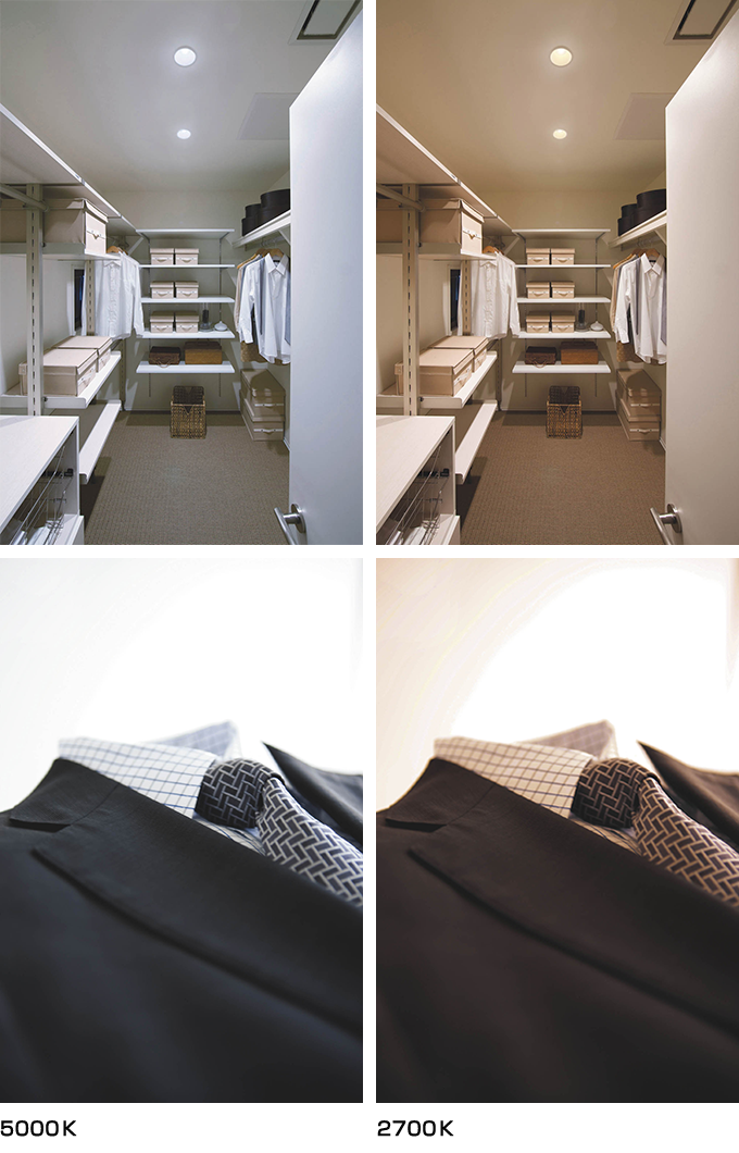
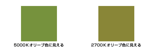
As a way to take advantage of differences in appearance, it has been proposed to change the lighting to match the place you are going when thinking about color coordination. Clear lighting with a color temperature of 5000K (Kelvin) is appropriate for business fashion. When you go out to eat, it might be a good idea to think about the lighting of a restaurant with a relaxed atmosphere, such as 2700K. The way colors look is quite different. Khaki color, which is a recent fashion trend, is a color that is extremely sensitive to the color of light, and in 5000k light it looks greenish and olive-colored, so you want to be careful about it. (The color display is an image.)
Whether it's in the interior of your home or the lights in your town, you may not be paying attention to colors, or you may choose them casually based on your habits. However, with the introduction of a new technology called LED, the color of the light can help deter customers and even affect their lifestyle and quality of life, so it may be time to reconsider. It seems that the number of people who choose light colors based on the fact that the color of food such as sashimi looks delicious is steadily increasing. I'm looking forward to seeing more research into the colors of lamps to make them easier to use, and more and more products becoming familiar to us.
November 30, 2015
Text by Japan Color Design Institute
Share