Business Edition #06 Commonalities and differences in color images in Asian countries
The need for local responses in global color strategies
While there are many Japanese companies operating with the global market in mind, the ones that are most focused on are Asian countries including China. Many people may think that their sensibilities are closer than in developed countries in Europe and America, perhaps because of the geographical distance and the closeness of people's body shapes and facial features. However, if you think about the development of product colors with that feeling, there is a possibility of failure. In other words, since this color is popular in Japan and sells well, the idea is to release the same color in Asia as well. Here, I would like to talk about the results of a color survey I previously conducted in Asian countries to help you understand the regional differences in tastes that are fostered by climate and natural features.
The Asia Color Survey was conducted in Japan, China, Thailand, and Vietnam. The characteristics of this survey are that it uses actual color charts (single color, color scheme) for all countries, and that it equally covers both men and women in a wide range of ages, from their 20s to their 50s. In recent years, web surveys are often used, but considering differences in appearance, it is more accurate to compare and consider using actual color charts. In addition, academic comparative research on color preferences and color emotions has been conducted in multiple countries. However, most of these studies are limited to university students and others, and there are few studies that cover a wide range of age groups and are evenly distributed.
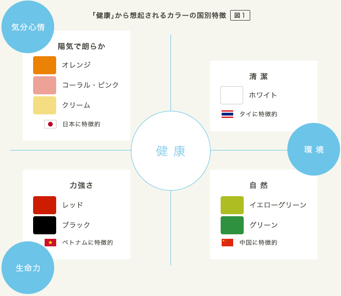
Is cheerfulness what you look for in "health"? Is it natural? Cleanliness? Vitality?
In the survey, we presented several concept words and asked them to select the appropriate color. One of these is "health," and the results varied greatly depending on the country (Figure 1). First, in Japan, the majority of people think of the color orange when they think of "health," followed by coral pink and cream. I feel that the warm, bright tones are healthy. On the other hand, in China, 40% of people recall the word yellow-green, followed by green. It is probably associated with natural trees and plants. Furthermore, in Thailand, white was overwhelmingly chosen over other colors. It is thought to convey an image of purity and cleanliness. In Vietnam, red was the most popular color at over 40%, followed by black at over 30%. Compared to other countries, the colors are clear and strong, and it seems that people are looking for strong vitality.
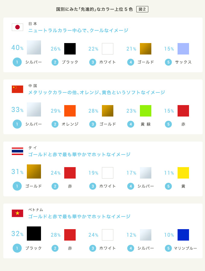
Is "advanced" a cool or warm feeling?
Next, let's look at the results for the concept word "advanced." As shown in Figure 2, there are differences in the colors that come to mind depending on the country. In Japan, silver is the most "advanced" color of choice, followed by black and white, which are cool neutrals. On the other hand, in Thailand, warm colors such as gold and red are chosen. If Japan has a slightly inorganic and cold modern feel, Thailand has a sense of glamor and glitter. In China, metallic colors such as silver and gold are also selected, but orange and yellow-green are distinctive colors that do not appear in other countries. It has a colorful and casual feel. In Vietnam, the recall rate for metallic colors is low, and colors with strong contrasts such as black and red appear, similar to "health".
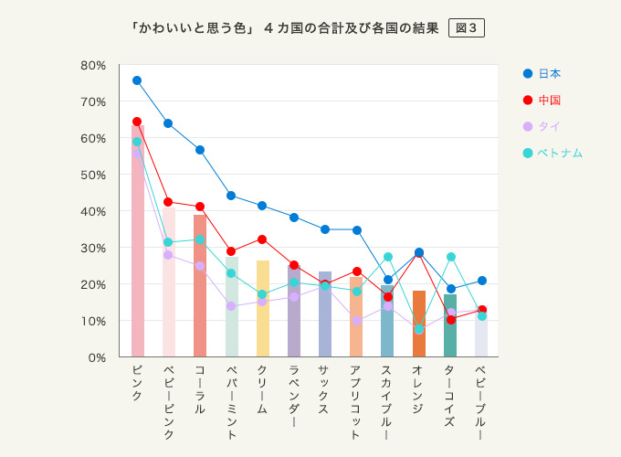
"Cute" colors are common in Asia
Finally, let's talk about "cute". Kawaii culture, which originated in Japan, has now become widely accepted internationally. Perhaps for this reason, the colors associated with the word "cute" in four Asian countries are concentrated in pinks (pink, baby pink, coral pink), as shown in Figure 3. Also, looking at the other colors, there are bright and soft tones, and there are fewer differences between countries than in "healthy" or "advanced". In Thailand, it can be said that cool hues such as turquoise and sky blue are somewhat characteristic, but overall, the idea that "cute" = pink is valid in Asia.
As you can see above, you can see that there are similarities and differences in the way basic concepts and words are understood in Asian countries. When deploying products and services globally, the most effective color usage can be standardized for all countries or regions, or it may need to be adapted to each country or region. Also, although we did not touch on it this time, consideration must be given to colors that are prohibited by preference, culture, or religion, and colors that have special meanings.
June 14, 2016
Text by Japan Color Design Institute
Share