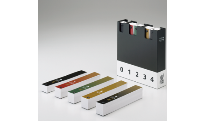
Business Edition #01 TOYO INK color sample book where you are sure to find the color that conveys your concept COLOR FINDER
COLOR FINDER composed of color data and marketing research in each field
The first color sample book planned and produced in Japan
The 1980s was a time when color printing technology advanced dramatically, and there was a movement to use color printing in some textbooks, etc., and it can be said that interest in color increased rapidly.
Even though it was an ink sample book, it was used as one of the design materials not only by people in the field of printing, but also by people in charge of design and product planning in many fields. Therefore, in response to such a situation, we aimed to create a color sample book that can be used in many fields with the TOYO INK color sample book COLOR FINDER.
COLOR FINDER that reflects the voices of professionals in various fields
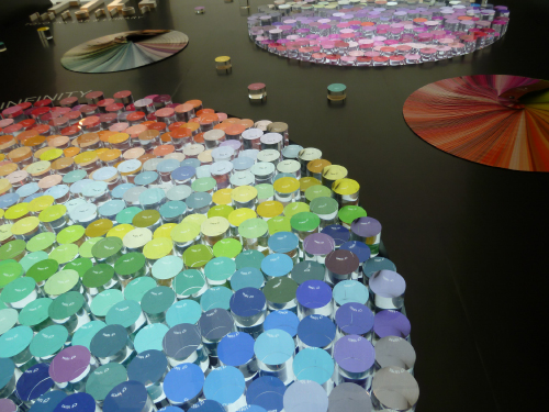
When creating the current COLOR FINDER, we first organized the colors used in printed matter. Until then, in the 1970s and early 1980s, concepts such as visual communication and visual merchandising were introduced, and many companies were working on this issue, so the perspective of colors used as corporate corporate colors was also important. did.
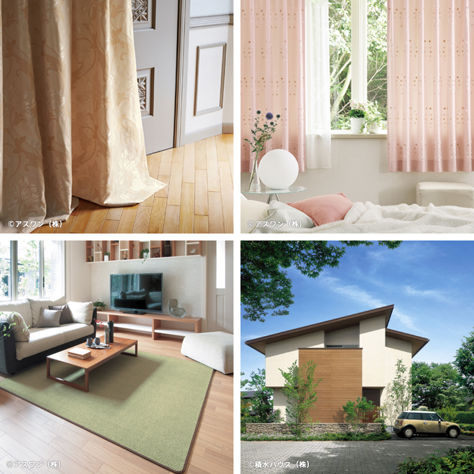
Not only that, we also conducted color distribution data that is actually used in the Japanese market. These fields include automobiles, home appliances, offices, architecture, housing, interiors, graphics, fashion, cosmetics, and household goods. Although the scope is not limited to ink, we focused on all fields that deal with color.
Next, we conducted interviews with designers, planners, and others who are active in various fields about how they use color sample books, how they actually decide on colors, and how they work. I did it.
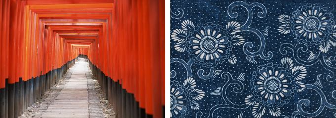
Through this process, it became clear that designers who are highly rated in their respective fields have more specific methods for color and have more technical knowledge, such as specifying pigments for inks. I was told that there is. They also have a very high awareness of the colors that are rooted in Japan's ancient colors and climate, demonstrating the importance of originality that originates from Japan.
I also realized once again that there are beautiful colors in a color sample book, and that you can get many hints just by casually looking at them.
Enabling delicate color expression to suit Japanese sensibilities
For example, when looking at colors, in order to judge the "accurate" colors, some kind of standard light source is required. We use "standard light": light source B, which is close to light, light source C, which is close to daylight, and light source D, which is synthetic daylight, which is close to natural light. The basic light source is the sun's light, which has all its energy continuously, and color measurement equipment uses a light source called standard light D65, which has a wavelength close to that. Probably a lot. In addition, the light source is evaluated by a value called "color rendering property Ra", which measures how close it is to sunlight. Using a lamp with high color rendering properties will make natural colors such as vegetables appear lively and ripe. If you want to measure visually without using any equipment, a north window with daylight is recommended. This is because there are few changes in light and it looks stable. When exposed to direct sunlight, the amount of light reflected is so great that it becomes shiny, making it difficult to see pale colors. When investigating colors outside, it is easier to see the colors when it is slightly cloudy and the light spreads softly over the entire surrounding area than when it is sunny.
Based on the results of many of these data and interviews, COLOR FINDER was created to incorporate not only traditional printing culture, but also Japanese lifestyle and traditional culture.
For example, representative examples include the shading of indigo dyeing, and the colors of blue flowers and gosu on tableware, and the subtle use of these colors is a uniquely Japanese sensibility. Most of these are classified as "blue-purple," but in Europe and the United States, "blue," which is a little more yellowish, is more common. It is difficult to find colors that are still commonly used today, such as vermilion, red red, and persimmon, in Western color samples.
Colors are used differently depending on the culture of each country.
COLOR FINDER is a color sample book made up of colors that have been cultivated in Japan.
The best tool for choosing colors

It's a set of 4, but the first and second colors are mainly clear "seiiro" color groups. It is composed of clear, highly saturated colors and pale, clear toned colors. Since they are composed of colors with similar properties, you can create a neat color coordination by combining the colors from these two.
Third, the color tone may be somewhat foreign in print media. The color composition is inspired by the Japanese use of dark colors. Japan uses natural dyes derived from plants, and has a climate where colors tend to fade with the changing seasons, and has a culture that has become accustomed to grayish colors. It has a history of being admired as a fashionable color, such as the brown variety called 48-cha Hyakumouse and grayish colors during the Edo period, and there are few places in the world that value subtle and subtle color differences. is.

The fourth color has a deep tone and is based on traditional colors that have been used in various countries, and has a color composition that can be used casually as the text color or line color. It is a color that is still used in fountain pen ink.
As mentioned above, COLOR FINDER was created with consideration to conveying the delicate and unique color sense of the Japanese people, so it is an easy-to-use color sample book when selecting colors that convey a concept. .
October 1, 2014
Text by Japan Color Design Institute
Share