Basics #05 “Measuring color”
In general, there are probably few people who have ever practiced "measuring color." Even among art university professors who specialize in color, there are few who have a colorimeter in their laboratory, and mechanical color measurement seems to be the work of only a few people at specialized companies. Specialized equipment is a special precision instrument, and because there is little demand for it, it can be said to be expensive and difficult to obtain. On the other hand, products that can easily measure color using smartphone apps have emerged and are attracting attention.
So this time, I would like to think about "measuring color."
1. Purpose of color measurement
I think there are two main purposes for color measurement. Firstly, the purpose is to accurately understand the colors in order to produce the same color, and the second purpose is to understand the color distribution and the range of color usage in the market. I think there are two main reasons.
1) Mechanical color measurement
When making an industrial product, it is necessary to produce exactly the same color. I think Japan's industrial products are very reliable in terms of color management. For more information on the machine for measuring color and its functions, please refer to the website of Konica Minolta (* or a company that manufactures colorimeters, etc.). I am not up to the explanation here, so please refer to it.
Measurement using a machine is more stable and accurate with a large machine, but I think that it has sufficient functions even for simple color measurement. It is better to choose according to the accuracy required by the business. The range of color differences that are allowed depending on the field is indicated in the Japan Industrial Standards. This is because the technology that can produce the same color strictly varies depending on the field.
- Specify the following areas of content:
Nippon Denshoku Industries Co., Ltd.
There are many companies that create tools called limit color charts that allow errors up to this range. This method is also approved by JIS. We create a range of colors in the form of color samples, such as a range of brightness that is acceptable or a difference in saturation that is allowed within this range.
Recently, it has become common to express the colors of landscapes in numerical values, and some people have thought that values other than those numerical values should not be accepted for things such as building materials. The tolerance level for the difference is set, so you should keep this in mind.
2) Visual measurement
There are many fields that use color measurement using the human eye.
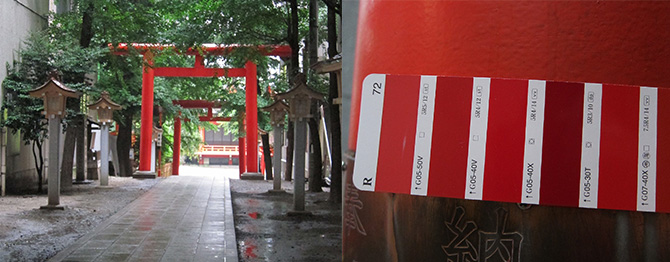
This is an application of the JIS visual perception measurement method, but for color measurement, the color appearance of fabric products is measured in a box covered with a matte achromatic color with a lightness L* of approximately 45 to 55. There is a company called. Since the color of the product appears to change when the color of the light source changes, this is a way to check whether the color looks the same under the light source lamp environment used in your store. This is probably due to the idea that the presentation to the customer should be in the best possible condition.
Also, when measuring colors outdoors such as in buildings, color measurements are performed using color samples under natural daylight. At architectural conferences, there are research presentations on the variation in measurements made by the human eye, so it can be said that this requires some skill. Visual measurement of color can be said to be a technique whose accuracy increases with practice.
For reference, let's take a look at the "observer" mentioned in "JIS 8723 Surface Color Visibility Comparison Method."
Observers need the ability to discern subtle color differences. Therefore, it is desirable to test using various color vision test charts. When an observer uses eyeglasses for vision correction, the eyeglass lenses must have uniform spectral transmittance in the visible spectrum. To avoid the effects of eye strain, do not look at pastel and complementary colors immediately after dark colors. When comparing bright, vivid colors, if the comparison cannot be made quickly, the observer must focus on the achromatic color in the peripheral vision for a few seconds before making the next comparison. If the observer performs the task continuously, the visual perception performance deteriorates significantly, so the observer must frequently take a break of several minutes during which he or she does not perform the comparison task.
Observers are asked to check their color vision and are cautioned against decreased ability due to fatigue. People tend to think that looking at colors is fun, but in reality, it can be very tiring if you keep staring at them and paying attention to the differences.
If you read the above warning, visual color measurement may seem inaccurate due to difficult conditions, but if you compare the color sample with the actual object, you will be able to see the actual color better. Masu. It is safest to measure visual perception by comparing with a color sample if you can look directly at the object. When you want to get a rough idea, it's easier to understand if you compare colors that are close to gray by applying gray, if you want to see a whitish color, use white, and if you want to see a blackish color, apply black.
2. The mystery of numbers and how they feel
For example, with the yellow-red hue called YR, if you lower the saturation (make it more grayish) and increase the brightness (make it brighter), it will appear closer to pink. Even though the numerical value of the hue is the same, people perceive it differently. The way colors appear in nature and the rules of the color system do not exactly match.
In recent years, there has been an interesting movement in ``expressing things numerically.'' It seems that the ``mechanical colorimetric values'' are taking on a life of their own. Measuring with a machine allows you to finely expand the minute saturation. For example, using Munsell's values, it would be difficult to treat colors with a saturation of around 0.1 or 0.2 as chromatic colors from the perspective of range. Even though the saturation increases when the area is made larger, I think it is better to think of it as a situation where it looks like a grayish color.
If you look at the various things that come with expressing colors numerically, you may start to think that colors are a pain or that there is no need to measure colors. However, it is only by properly measuring colors that we can learn about the characteristics of ``perceived deviations'' and ``changes in the natural appearance of pigments and dyes.''
3. Utilization of color measurement data
By measuring colors and compiling the results into a hue, lightness, and saturation table, you can see which colors are concentrated, that is, which colors are used more frequently. These data are used in the color codes used in sales analysis in the distribution industry.
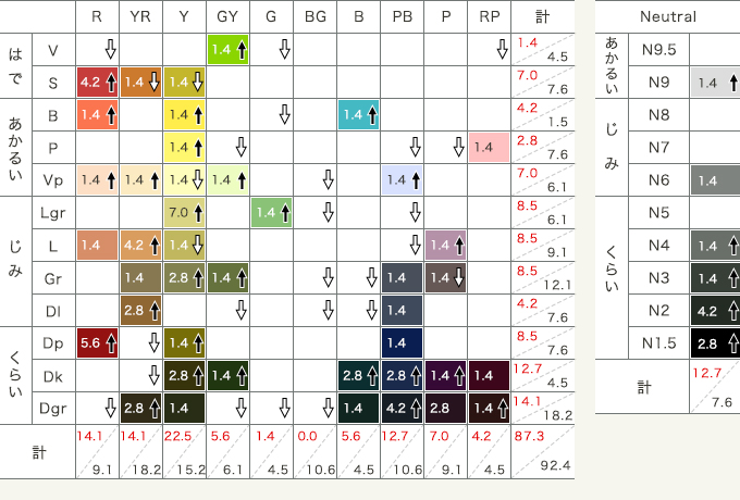

For example, the table and graph shown here measure and organize color trends proposed by multiple organizations for ladies in the fall/winter of 2016. This has the advantage of being easy to understand, as you can see a list of what hues and tones (color tones such as pale, dark, flashy, plain, etc.) are increasing.
When you measure colors, you can feel that various situations are buried in the data, such as understanding the current state of how colors are used, whether there are any deficiencies, and predictions of color expectations. If you compare colors over time and continue to accumulate data, you will find that some colors have been loved for many years.
4. Expansion of “measuring color”
I think the convenience of representing colors numerically will continue to be used more and more as a common language for people with various visual characteristics. As I mentioned at the beginning, the ability to easily measure color on smartphones and other devices is progressing, so I think it will become more commonplace. I hope that people will think about how to use it effectively and make full use of it while taking into account the fact that it can be seen differently and the range of permissibility depending on the field.
August 31, 2016
Text by Japan Color Design Institute
Share