Basics #03 Munsell Color System

Among the color systems, the Munsell color system is the most common. In product catalogs, etc., these values are sometimes listed as reference values for product colors. However, I hear many people say that it is difficult to understand. On the other hand, some people say that because the system relies on color samples, it lacks accuracy. Let's take a closer look.
A color system developed in response to the times
The Munsell color system is a typical color system for color developers, and is designed to be captured using color samples. Mansell, an American painter and colorist, published it in 1905, but at that time the first mass-produced automobiles in the United States were attracting attention and the famous Model T Ford was beginning to be produced. People began to become aware of the color design of industrial products, including those in other fields, and it was probably perceived as an easy-to-use system. However, since it is based on color samples created by individuals based on their judgment of color differences and sense of distance, it is necessary to organize them in order to make full use of them, and in 1943 the Optical Society of America conducted a visual evaluation experiment. We will make corrections and present a system that evenly lines up the optical values. This is the modified Munsell system, which is also used in Japan as JIS (JAPAN INDUSTRIAL STANDARD).
How to write the Munsell symbol
The idea is to understand color as three attributes: "hue," "lightness," and "chroma," and express it using the Munsell symbol "hue, lightness/saturation." Munsell numerical values are expressed using the following notation: hue, lightness/saturation.
Since it has three attributes, it is a color solid system, so it tends to give the impression that it is difficult to understand what is inside at first glance. So let's take a look at them one by one.
Hue (difference in hue)
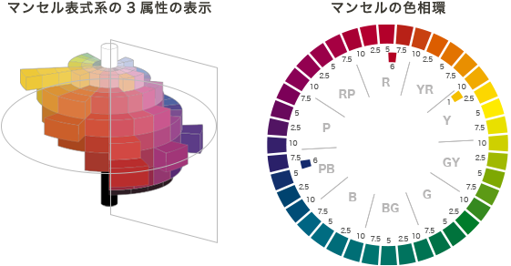
First of all, hue refers to the difference in color tone, such as red or blue. Based on the five basic colors: red, yellow, green, blue, and violet (R, Y, G, B, and P, respectively), and the yellow-red YR, yellow-green GY, blue-green BG, blue-purple PB, and red-purple between each. RP is added to make 10 hues. Munsell further divided the 10 hues into 1 to 10, creating 100 hues. When it comes to actually learning it as a system, some American art schools teach using the basic RYGBP five hues.
Here, let's take a look at the 40 hue wheel, which divides the 10 hues into 4 parts of 2.5-5-7.5-10, as used in Japan's JIS.

The same R includes colors that gradually change from purple to yellowish red. It is difficult to name it in traditional Japanese color names, but it is probably close to crimson, red, scarlet, and vermilion.

Y includes colors that range from orange to yellow-green. At 10 GY, it looks like yellow-green, and some people may feel that there is a gap between how we perceive it in daily life and the system.

It may be easier to understand the hue of Y by saying banana-yellow-lemon-lime rather than the Japanese color names.
Brightness (degree of brightness)

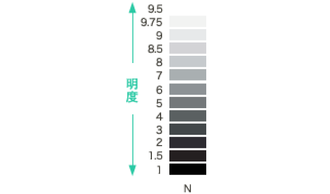
The brightness of gray is probably the color of exposed concrete, which is often seen. It can be expressed as a lightness of 7.0 in a dry state. If you use this as a standard, you can get a rough idea of the colors in the city.
Colors whose only element is brightness are called achromatic colors.
The display method is N8.0, which is the acronym for NEUTRAL.
Saturation (difference in vividness)
Of Munsell's three attributes, saturation is arguably the most difficult to understand. It shows the degree of vividness of the color. It is said that by adding a pure color to gray, which has no saturation, and creating a saturation of 1.0 where the appearance changes, the numerical value was initially at the stage (perceptual isotemporality) that the inventor Munsell felt. It seems that the saturation of 1, 2, and 3 has been decided. As shown below, the lightness position that indicates maximum saturation differs depending on the hue. This can also be said to be one of the reasons why the Munsell system is difficult to understand. However, looking at it the other way around, this system continues to be used today because it has the flexibility to add highly saturated colors, which have become newly expressible due to technological innovations in materials and other areas.

What you need to know is that colors with a saturation of 2 or less are called low saturation, a group that is close to gray. This trend is the same for all hues. When the saturation is even lower, around 0.3 or less, it can generally be classified as an achromatic color.
However, the classification of medium saturation and high saturation differs depending on the hue. Some colors such as red, yellow-red, and yellow have a saturation of 15, but blues have a property that it is difficult to achieve saturation to that extent. If you look at the same saturation of 9, the impression of high saturation for yellow-red is already fading at 9, but for the hue of blue, it falls into the high saturation group with a very vivid impression.

- Reference/So, one way to understand this is to incorporate the idea of tone.
Regardless of the hue, the color that has the highest saturation and is closest to a pure color is considered to be the high saturation color group, regardless of brightness.

Munsell color system that can be used to suit the times and cultures
Recently, even in the blue family, colors with higher saturation have been developed, and it has the advantage of being able to incorporate and understand such colors into the Munsell system, so it can be used to measure various natural colors. I think it would be a good idea to reconsider it as a flexible, human-friendly system that allows you to learn about the characteristics of new materials with good color development.
When understanding the Munsell color system, we recommend looking at the color swatches themselves. ``Get used to it rather than learn it'' is the basic principle when dealing with colors. It would be a good idea to experience the differences in the expressions of various colors indicated by numerical values.
However, because it is based on Western sensibilities, the basic classification of 2.5-5-7.5-10 has the disadvantage that it is difficult to express the color of indigo, which has long been loved in Japanese culture, and the colors of natural materials. I can't deny it. For the commonly used reds, the 6R classification is necessary, and for medium to dark indigo dyes, the 6PB hue is important. A hue of 1Y is also necessary to capture the natural colors of soil and trees.

However, I think one aspect of the system that makes it easy to utilize is that it allows for such comparative considerations and can also display colors with hues in between.
When measuring familiar colors using a color sample or using a colorimeter, you may find that you are sensitive to slight differences in brightness or hue. When people are not feeling well, they look pale, dull, and dark, and it becomes clear that people have an excellent ability to see the complexions of those around them. I would like you to explore the characteristics of colors in various fields using Munsell numerical values.
January 29, 2015
Text by Japan Color Design Institute
