that depicts the thoughts of artience with "movement" and "sound" artience motion logo
"artience motion logo" is a motion logo that uses "movement" and "sound" to intuitively convey the image that artience is aiming for.
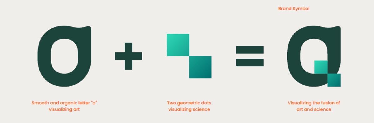
The artience symbol is composed of an organic, soft "a" shape that visualizes art and a geometric "dot" that visualizes science.
We do not use a "logotype", which is also a language, but use this symbol to make it perceptible.
In the motion logo released this time, the symbol mark is drawn using "movement" and "sound" with the following three concepts.
Brand Promise expresses "Create value that resonates with the senses, build a future where all people can live enriched lives."
The movement of carefully drawing the soft curves of the "a" for art creates an effect on the human "power to feel" caused by beauty, comfort, texture, etc.
Then, by overlapping the "a" line so that the two dots representing science spread out from the center, it expresses the fusion of art and science to create value that resonates with the senses.
The movement of the two lines outlining "a" starts from a close place, and each draws a soft circle in opposite directions and returns to the same place.
This represents our role in connecting various technologies and ideas to lead to solutions to the problems faced by society.
By superimposing the sound that feels the image of "spreading" and "resonating" with the movement of the symbols, we believe that we will realize a future where all people can live enriched lives by combining the power of not only our company but also diverse people and connecting their thoughts.
Share